Our Brand Mark
THE LOGO
LOGO EVOLUTION
GENERAL
Compared to the 2021 logo, the latest logo has now been
revised and has been adapted to the new brand positioning.
The reduced presentation without shadows and borders
creates a more modern and appealing character.
As Amicelli is a registered trademark, it is very
important that the registered mark ® is
always communicated together with the logo.
The registered mark should therefore never
be removed from the logo.
EXCEPTION: If Amicelli is written as a word, the
registered trademark does not have to be included

LOGO COLOUR & BACKGROUND
GENERAL
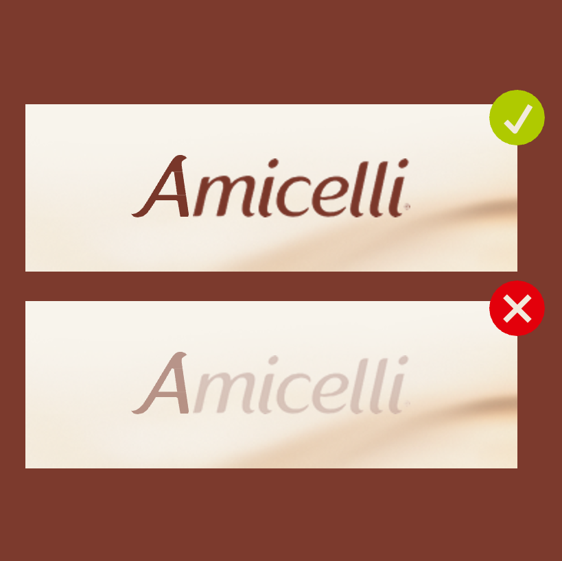
The Amicelli logo, as the most important element of the brand’s visual identity,
should always be at the forefront of any visual communication.
It must be used in its original form without any alterations,
as it holds the highest priority in the design process.
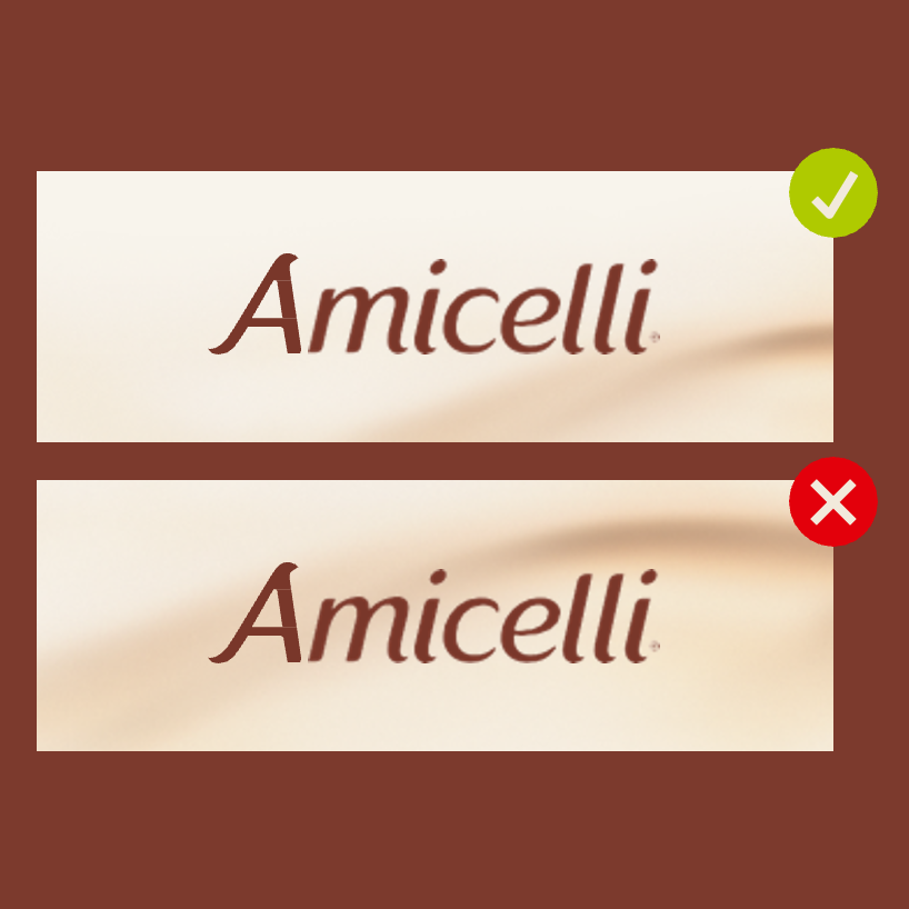
The logo should preferably be used in
brown on a lighter background to make it stand out.
In exceptional cases it can be used in the inverted version -
white - on a darker background.
LOGO VERSIONS
PACKAGING
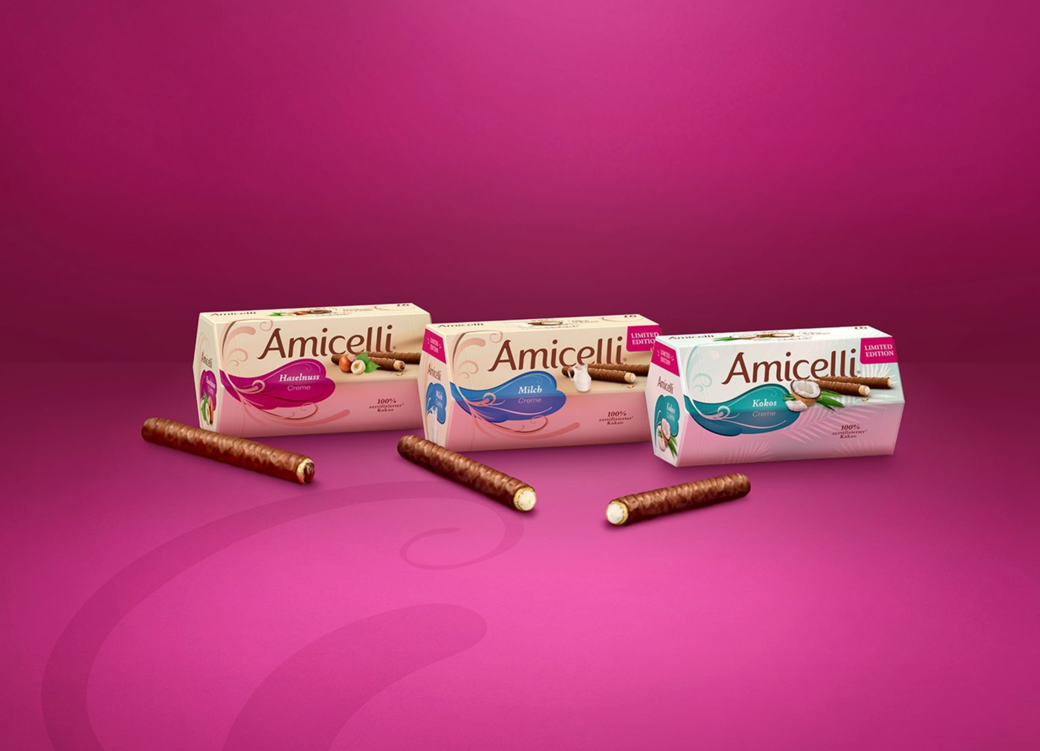
The Amicelli logo is available in different variants
for its usage on the packaging:
- word mark only without background
- with brown swoosh background
- with brown swoosh background including product image of the wafer roll and its ingredient
These are to be used according to the medium.
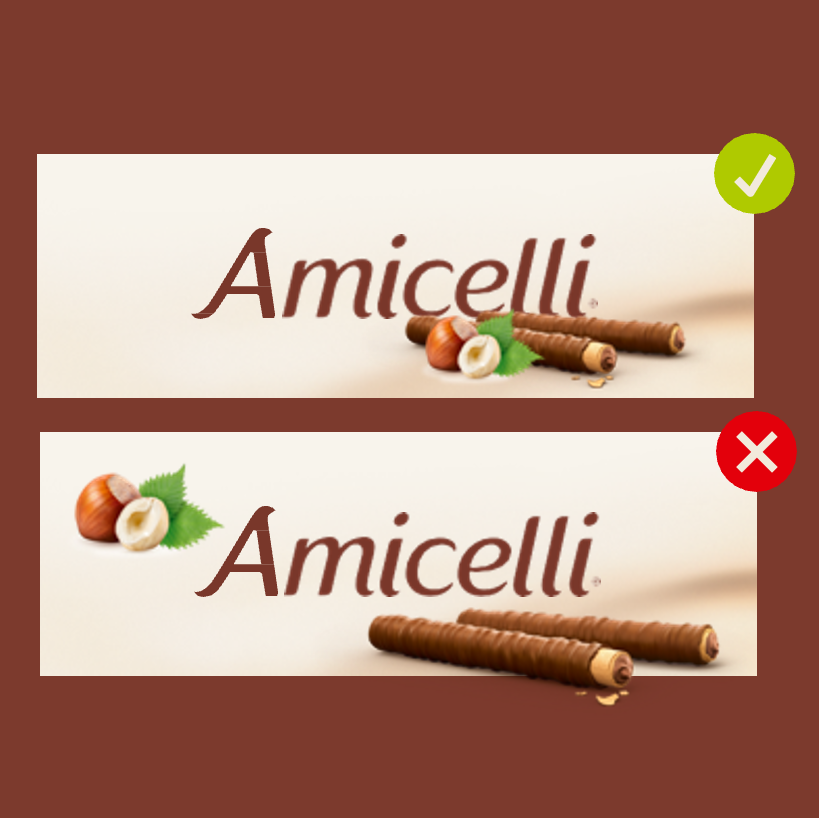
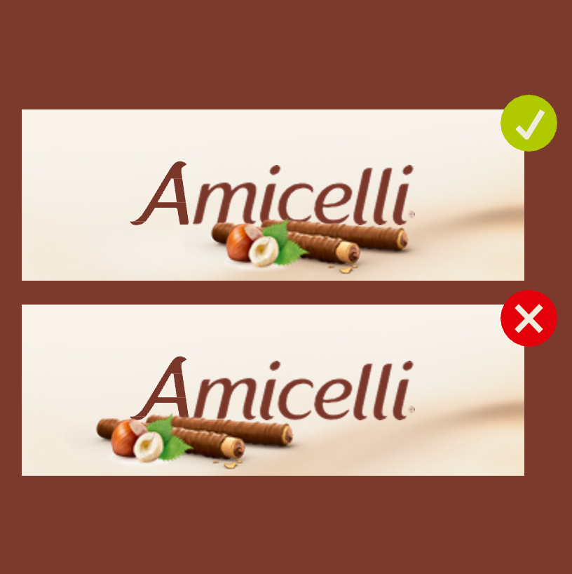
On the facing of the packaging, we always use
the logo with the product image.
On the lid the logo is decoupled from the
product image and placed on its own.
On the side of the packaging, we show
the logo
completely without roll.
LOGO POSITIONING
PACKAGING
The hexagonal packaging is iconic
for Amicelli, but also allows for the
packaging to turn on shelf.
The product packaging might therefore not
always be positioned in the prefect front view.
To make sure, that the logo is seen
from all sides, the logo should be integrated
on the following packaging sides.
Local variations due to legal restrictions
might be possible but need to be discussed
with Global Product Management.
LOGO DO's & DONT's
PACKAGING

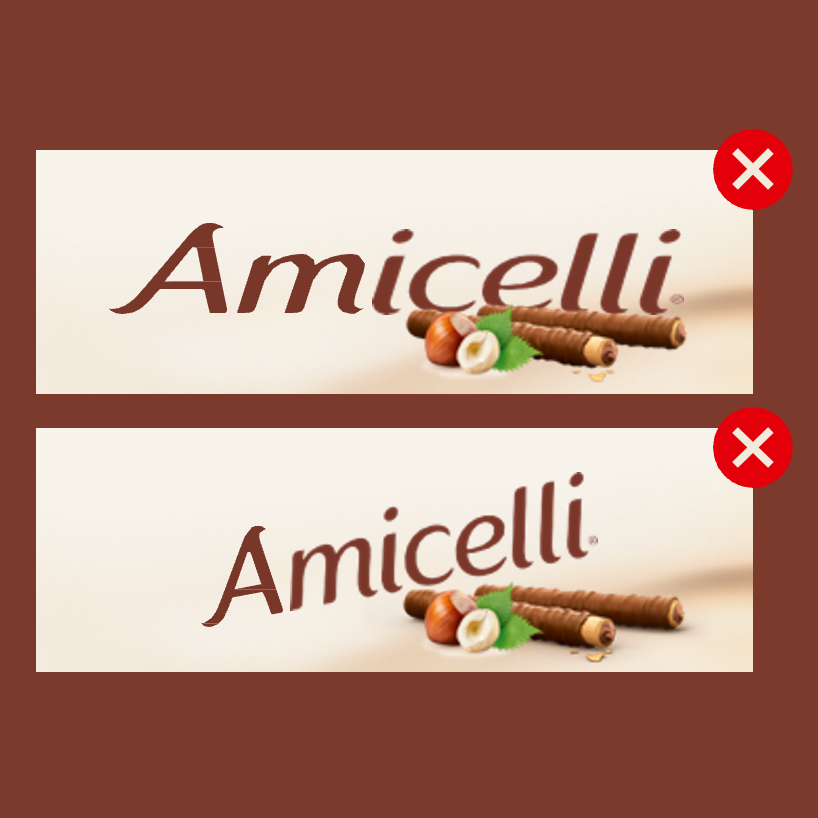
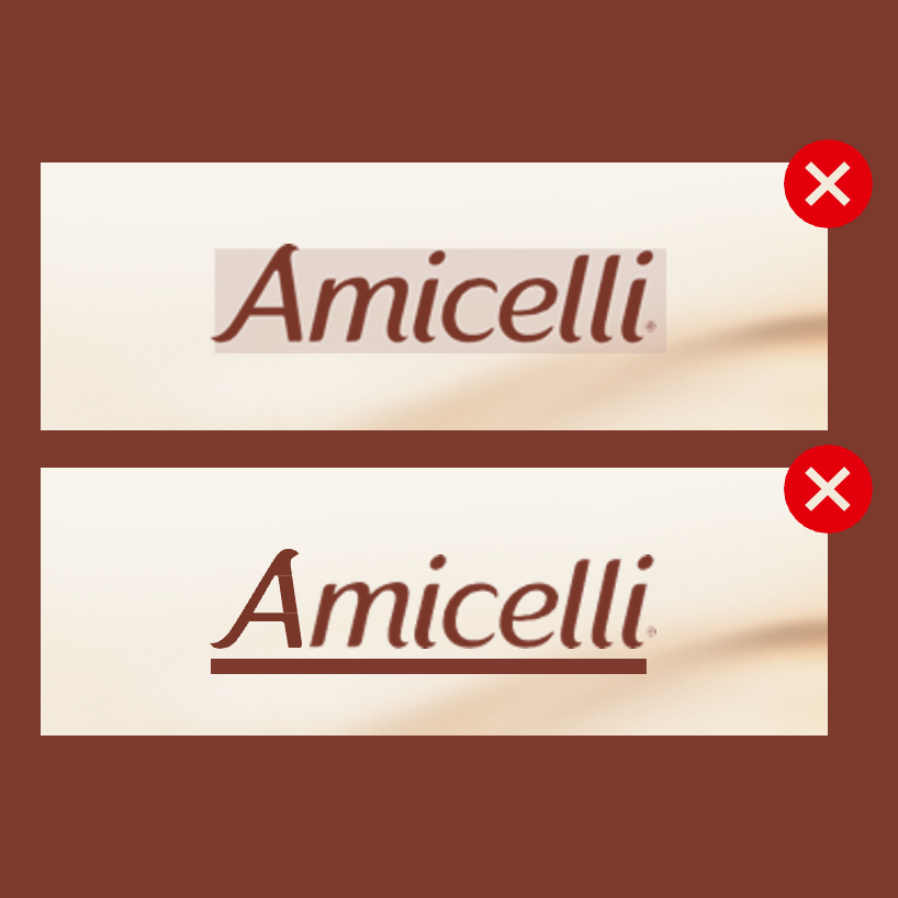
The Amicelli logo is always in the same place above the brown swoosh
The swoosh must not
be moved or changed
in size in relation to
the word mark
The main motive on the
facing must remain
unchanged and met not
be changed in size and
position to the logo
The product image
should not be shifted
horizontally or vertically.
LOGO SIZE & POSITIONING
COMMUNICATION
The logo size depends on the respective format.
The standard size is based on a portrait format
DIN A4 with a logo height of 12mm and width of 52mm.
(The logo width should always be approximately 1/4 of the visual size)
The logo is always positioned in the centre.
The preferred position is at the bottom.
However, the logo can also be moved along the
vertical axis to the top of the visual.
A minimum distance to the horizontal edge, whether
at the top or bottom, should always be maintained.
This minimum distance to the lower or upper edge should be 20mm in portrait format and 15mm in landscape format.
PLEASE NOTE:
Prioritize readability and contrast when choosing the logo position. Whenever possible, avoid overlapping the logo with important parts of the image such as products or faces.
PROTECTION ZONES:
The logo has defined protection zones in all directions.
The minimum distance to the horizontal edges from the logo is
20mm in portrait format and 15mm in landscape format.
The minimum distance to the vertical edges from the logo is
50mm
in portrait format and
100mm in landscape format.
FURTHER EXAMPLES - DOCUMENTS & OTHER FORMATS
LOGO DO's & DONT's
COMMUNICATION
DO's


DONT's


[Sticky Row Identifier]
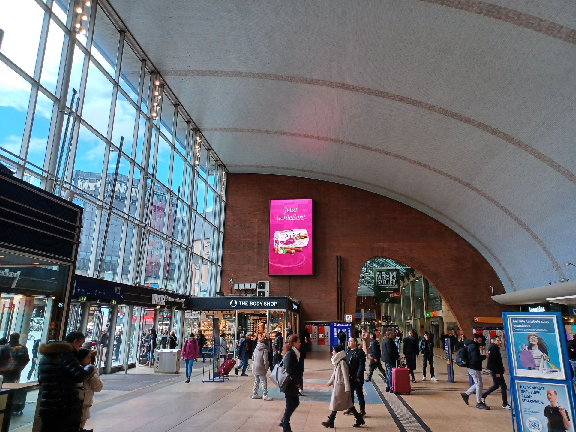
Some countries are already successfully working
on bringing our brand to life. See best practices
and get inspired for your own journey.
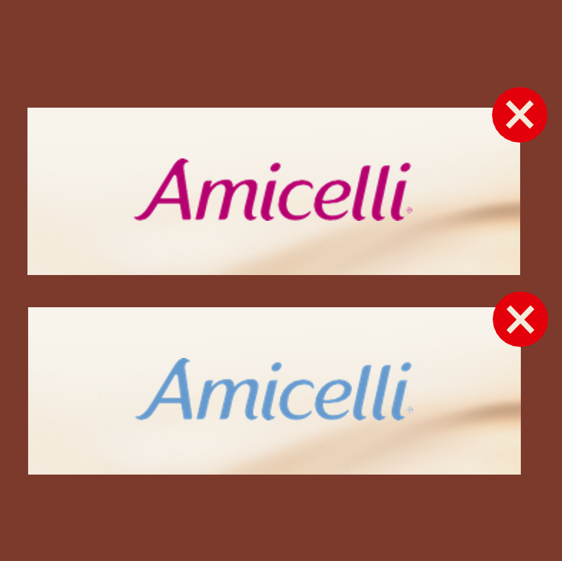
COLOURS
Amicelli’s main brand colours and
their combinations are an important part
of the Amicelli appearance.
Discover how we use and execute them.
GET INSPIRED
Some countries are already successfully working
on bringing our brand to life. See best practices
and get inspired for your own journey.