Our physical implementations
PACKAGING DESIGN
PACKAGING DESIGN
LOGO DO's & DONT's
LOGO SIZE & POSITIONING
The logo size depends on the respective format.
The standard size is based on a portrait format
DIN A4 with a logo height of 12mm and width of 52mm.
(The logo width should always be approximately 1/4 of the visual size)
The logo is always positioned in the centre.
The preferred position is at the bottom.
However, the logo can also be moved along the
vertical axis to the top of the visual.
A minimum distance to the horizontal edge, whether
at the top or bottom, should always be maintained.
This minimum distance to the lower or upper edge should be 20mm in portrait format and 15mm in landscape format.
PLEASE NOTE:
Prioritize readability and contrast when choosing the logo position. Whenever possible, avoid overlapping the logo with important parts of the image such as products or faces.
PROTECTION ZONES:
The logo has defined protection zones in all directions.
The minimum distance to the horizontal edges from the logo is
20mm in portrait format and 15mm in landscape format.
The minimum distance to the vertical edges from the logo is
50mm
in portrait format and
100mm in landscape format.
LOGO DO's & DONT's
FRONT OF PACK & BACK OF PACK
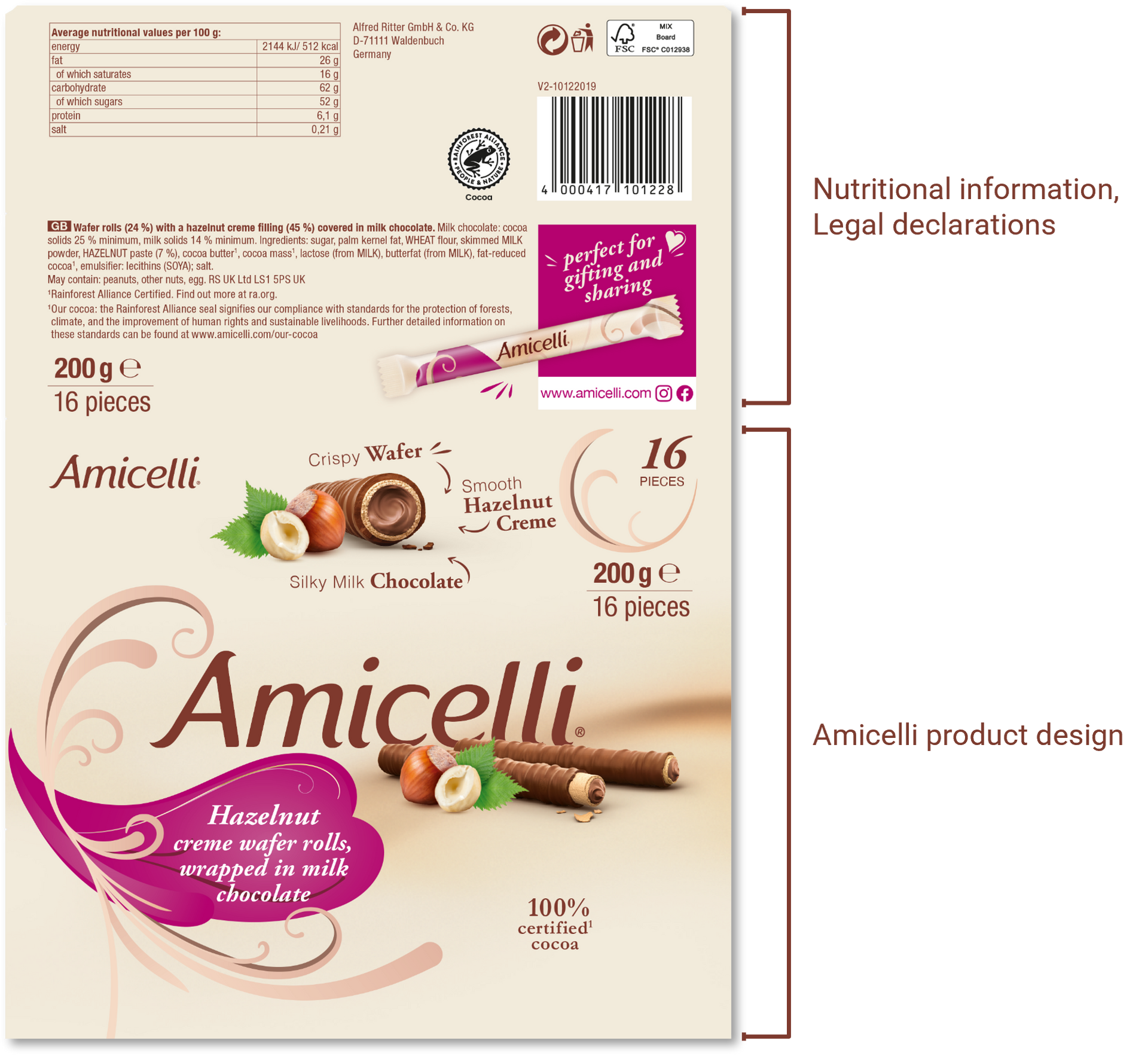
INCLUDING LEGAL LANGUAGE DECLARATIONS
Ideally the nutritional information, EAN-Code, addresses and
other legal declarations are confined to the upper top part of the packaging to interfere with the design below as little as possible.
Local variations due to legal restrictions might be possible but
need to be discussed with Global Product Management.
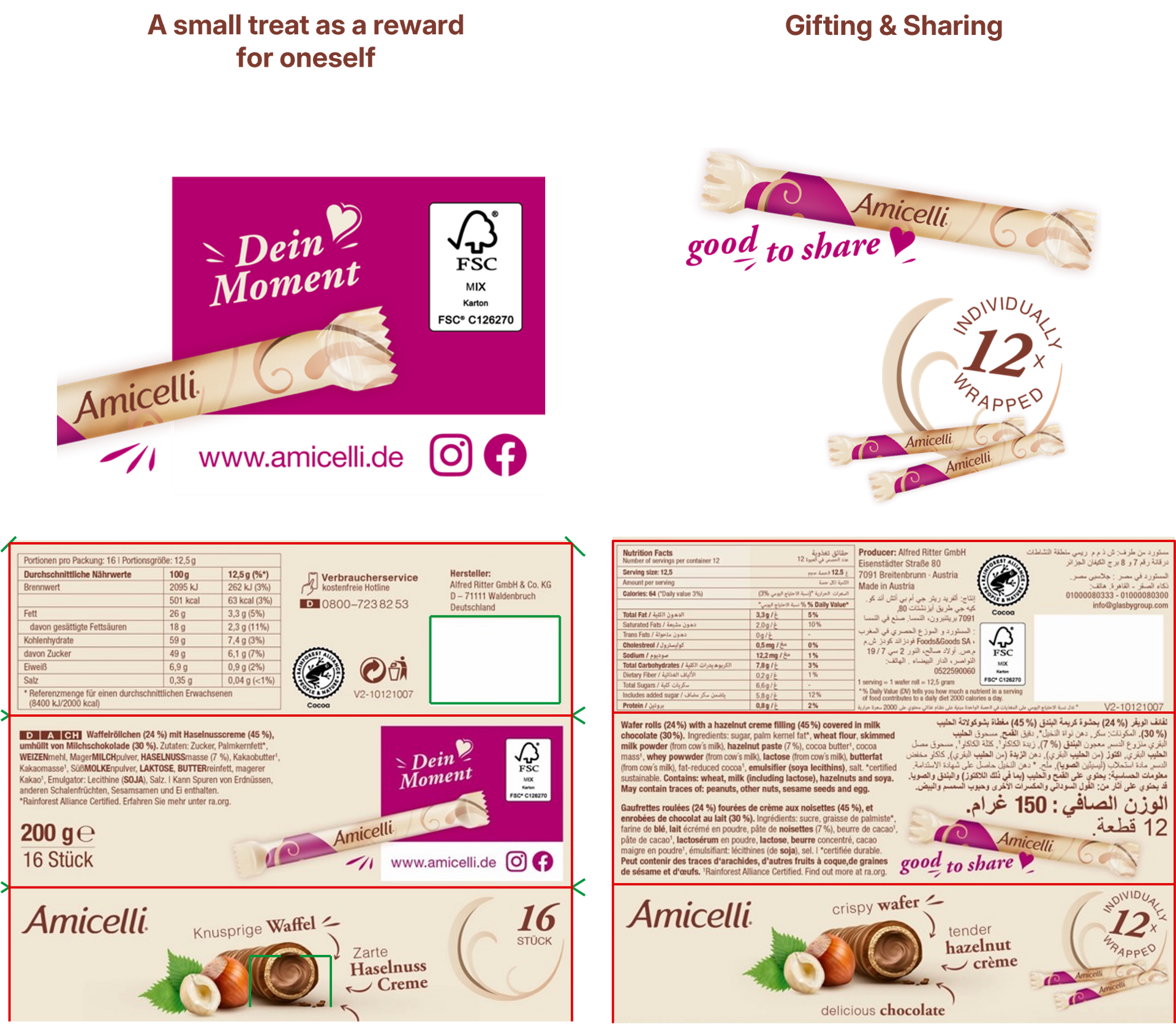
BACK OF PACK
Placement of usage occasion depending on brand
positioning within the market.
(Example: A small treat as a reward for oneself /
Gifting & Sharing).
The individual wrapping can be communicated using the
following design element on the packaging in markets in
which it presents a consumer benefit.
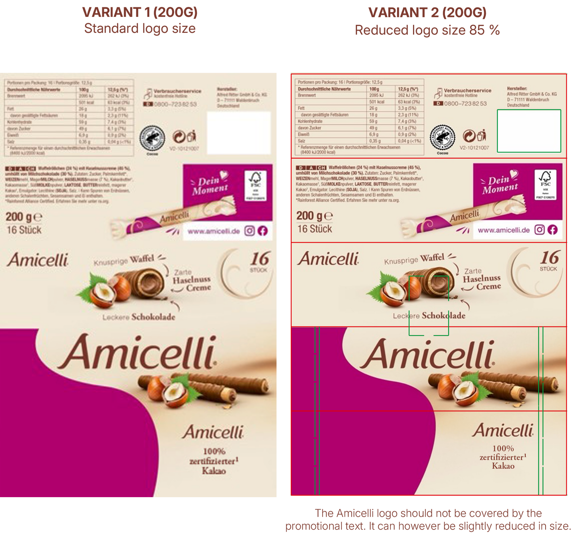
ON PACK PROMOTIONS
On-Pack promotions can be a useful tool to generate
additional attention for the product at the Point of Sale.
For On-Pack Promotions there is a defined field
that can be used to get the marketing message across.
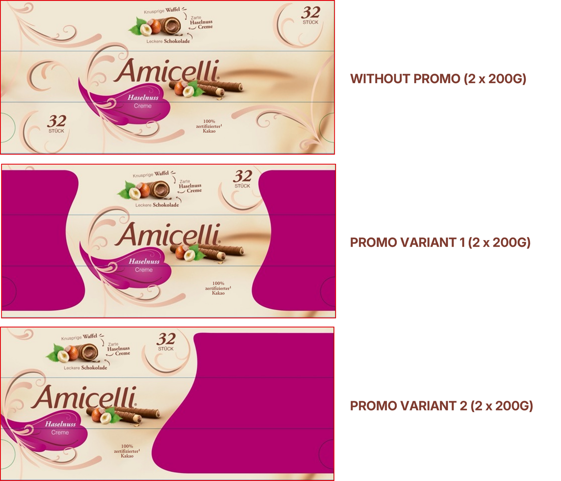
SLEEVE PROMOTIONS
Sleeve Promotions are an important tool as well as they can draw additional attention to the larger communication area that can be used on the front of the packaging.
• The cluster of the logo, product picture, and
stopper cloud should always be kept intact.
• The promotional area can vary depending on
the promotional content (Promo Variant 1 or 2).
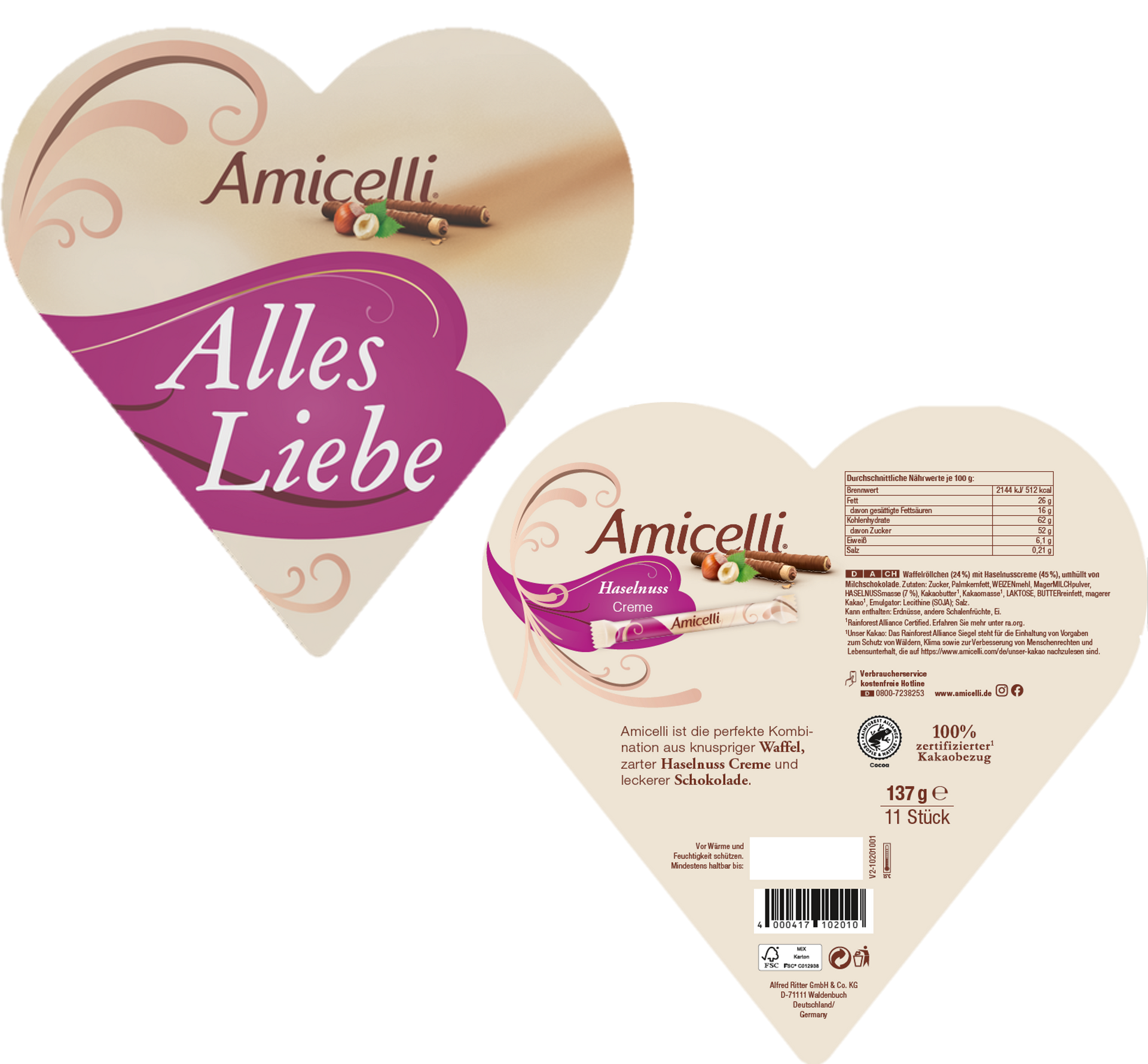
SPECIAL FORMATS - HEART
The 137g Heart Box encourages the gifting occasion of Amicelli and is a strong trigger to emotionalize the product.
To secure the brand essence the design must include:
•Logo including product image of the wafer roll and its ingredient
•Flavour Cloud
•Tendrils can be removed if they do not fit into the design
•Shadow behind the logo can be removed if it does not fit into the design
Local variations might be possible but need to be discussed with Global Product Management.
-Pack promotions can be a useful tool to generate
additional
attention for the product at the
Point of Sale.
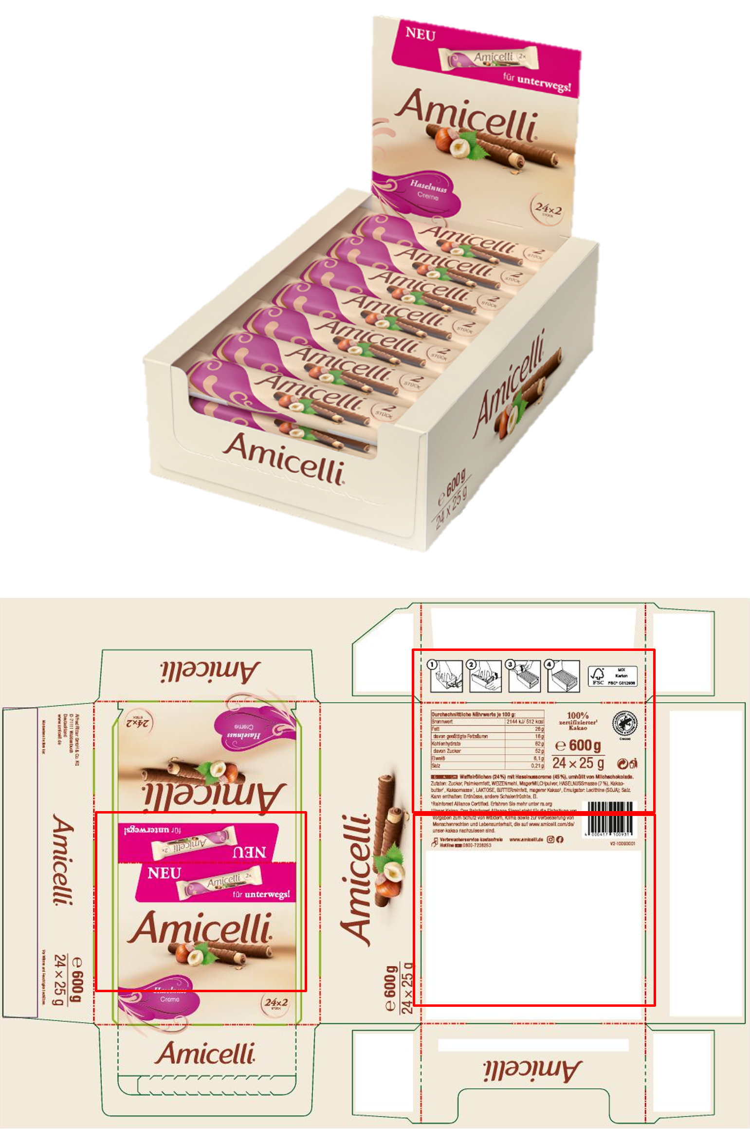
SPECIAL FORMAT - COUNTERTOP DISPLAY
The 600g countertop display with the Amicelli Doublefinger supports the On-the-Go occasion and enables the contact to new buyers.
The elements of the hexagon box are adapted to the display. All core brand elements are visible.
The white part on the bottom of the display needs to stay white for production reasons.
[Sticky Row Identifier]
Some countries are already successfully working
on bringing our brand to life. See best practices
and get inspired for your own journey.

TONE OF VOICE
Amicelli’s brand tonality defines our voice and personality, ensuring a consistent and engaging communication. Discover how we bring it to life.
GET INSPIRED
Some countries are already successfully working
on bringing our brand to life. See best practices
and get inspired for your own journey.