Our Brand Tonality
TONE OF VOICE
LOGO VERSIONS
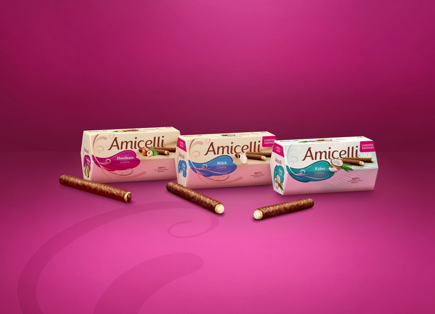
The Amicelli logo is available in different variants
for its usage on the packaging:
- word mark only without background
- with brown swoosh background
- with brown swoosh background including product image of the wafer roll and its ingredient
These are to be used according to the medium.
On the facing of the packaging, we always use
the logo with the product image.
On the lid the logo is decoupled from the
product image and placed on its own.
On the side of the packaging, we show
the logo
completely without roll.
LOGO POSITIONING
The hexagonal packaging is iconic
for Amicelli, but also allows for the
packaging to turn on shelf.
The product packaging might therefore not
always be positioned in the prefect front view.
To make sure, that the logo is seen
from all sides, the logo should be integrated
on the following packaging sides.
Local variations due to legal restrictions
might be possible but need to be discussed
with Global Product Management.
LOGO DO's & DONT's
COMMUNICATION
The logo size depends on the respective format.
The standard size is based on a portrait format
DIN A4 with a logo height of 12mm and width of 52mm.
(The logo width should always be approximately 1/4 of the visual size)
The logo is always positioned in the centre.
The preferred position is at the bottom.
However, the logo can also be moved along the
vertical axis to the top of the visual.
A minimum distance to the horizontal edge, whether
at the top or bottom, should always be maintained.
This minimum distance to the lower or upper edge should be 20mm in portrait format and 15mm in landscape format.
PLEASE NOTE:
Prioritize readability and contrast when choosing the logo position. Whenever possible, avoid overlapping the logo with important parts of the image such as products or faces.
PROTECTION ZONES:
The logo has defined protection zones in all directions.
The minimum distance to the horizontal edges from the logo is
20mm in portrait format and 15mm in landscape format.
The minimum distance to the vertical edges from the logo is
50mm
in portrait format and
100mm in landscape format.
LOGO DO's & DONT's
AUTHENTIC AND CONFIDENT:
Our voice is genuine and self-assured. We know our value and communicate it clearly, without overshadowing others.
BALANCED AND INSPIRATIONAL:
We are aware of our own needs and radiate a balanced energy that inspires others.
MODERN AND TRENDY:
We stay current with lifestyle trends, bringing a fresh, contemporary vibe to our communications.
When Amicelli speaks, it radiates positivity, joy of life,
and a sense of playful lightness.
Our voice is warm, modern, and feminine, reflecting the
high-quality and indulgent nature of our brand.
We approach life with a sense of ease and spontaneity,
embracing the unplanned beautiful moments that come our way.
HOW DO WE SPEAK?
POSITIVE &
JOYFUL:
Our language is infused with positivity and good humour. We find joy in life and express it in every word.
01.
APPROACHABLE AND SOCIABLE:
We speak like a trusted friend, always accessible and engaging. Our tone is informal and conversational, making everyone feel at ease.
02.
AUTHENTIC AND CONFIDENT:
Our voice is genuine and self-assured. We know our value and communicate it clearly, without overshadowing others.
03.
MODERN AND TRENDY:
We stay current with lifestyle trends, bringing a fresh, contemporary vibe to our communications.
04.
BALANCED AND INSPIRATIONAL:
We are aware of our own needs and radiate a balanced energy that inspires others.
05.
WHAT DO WE AVOID?
CONTROVERSIAL TOPICS:
We steer clear of politics, sexual orientation, and weapons/war.
Our focus is on creating a positive and inclusive environment for everyone.
01.
OVERCOMPLICATING LANGUAGE:
Overcomplicating Language: Our speech is easy to
understand, ensuring clarity and accessibility for all.
02.
GENDER-SENSITIVE LANGUAGE
We enthusiastically support a positive interpersonal atmosphere of
mutual trust, reliability and ownership across all levels.
We aspire to a cooperative and long-term relationship with our business
partners that is characterised by fairness, trust and reliability.
All employees share in the success of the business.
[Sticky Row Identifier]
BRAND FRAME
To ensure a consistent look & feel, the Brand Frame defines the guiding principles for creating branded executions. Discover how be bring our brand to life.
GET INSPIRED
Some countries are already successfully working
on bringing our brand to life. See best practices
and get inspired for your own journey.