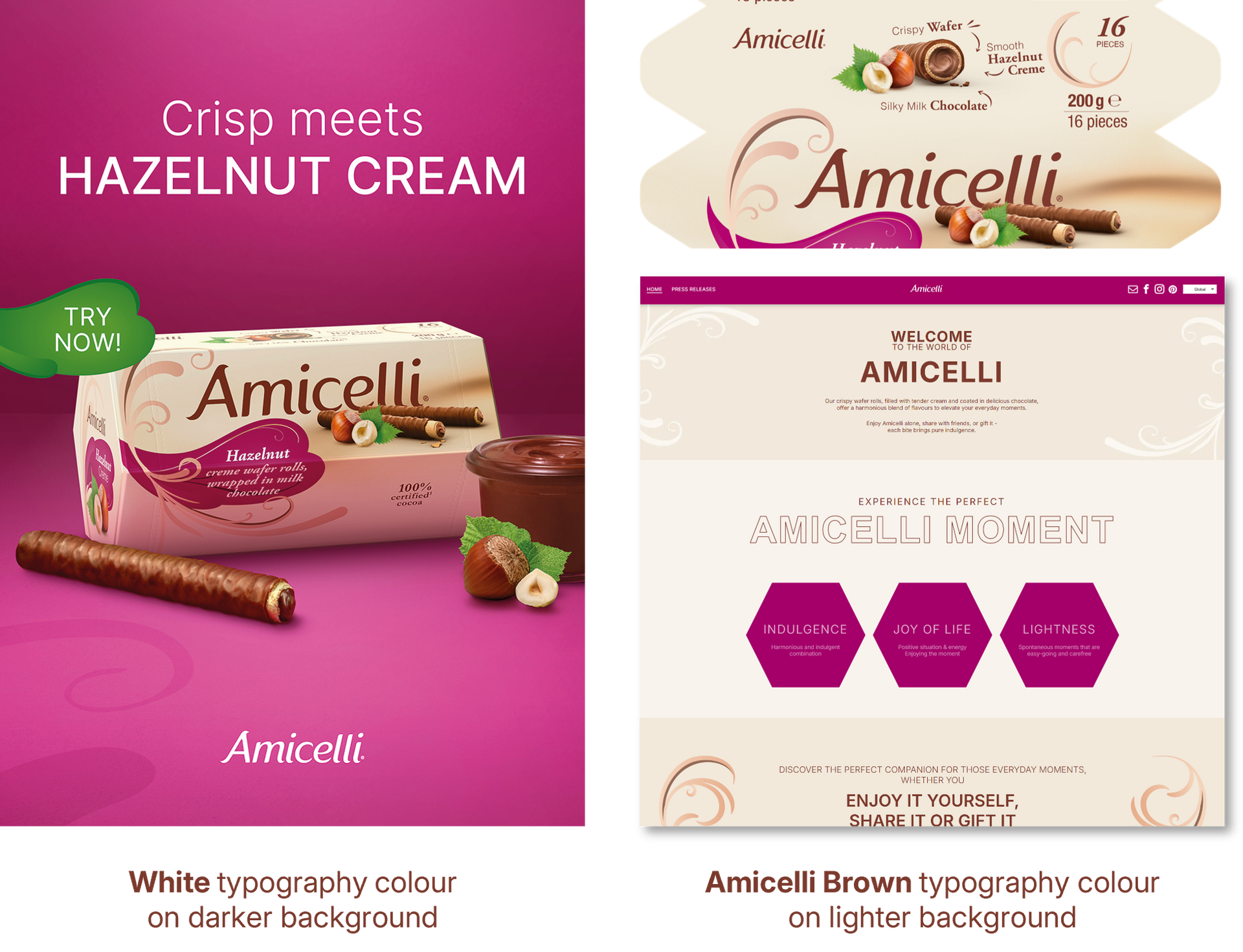
Our Brand Type
TYPOGRAPHY
GENERAL
GENERAL
LOGO DO's & DONT's
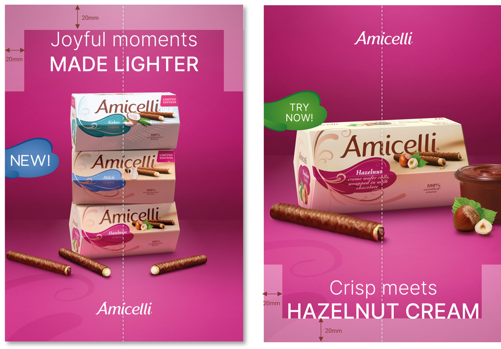
LOGO SIZE & POSITIONING
The logo size depends on the respective format.
The standard size is based on a portrait format
DIN A4 with a logo height of 12mm and width of 52mm.
(The logo width should always be approximately 1/4 of the visual size)
The logo is always positioned in the centre.
The preferred position is at the bottom.
However, the logo can also be moved along the
vertical axis to the top of the visual.
A minimum distance to the horizontal edge, whether
at the top or bottom, should always be maintained.
This minimum distance to the lower or upper edge should be 20mm in portrait format and 15mm in landscape format.
PLEASE NOTE:
Prioritize readability and contrast when choosing the logo position. Whenever possible, avoid overlapping the logo with important parts of the image such as products or faces.
PROTECTION ZONES:
The logo has defined protection zones in all directions.
The minimum distance to the horizontal edges from the logo is
20mm in portrait format and 15mm in landscape format.
The minimum distance to the vertical edges from the logo is
50mm
in portrait format and
100mm in landscape format.
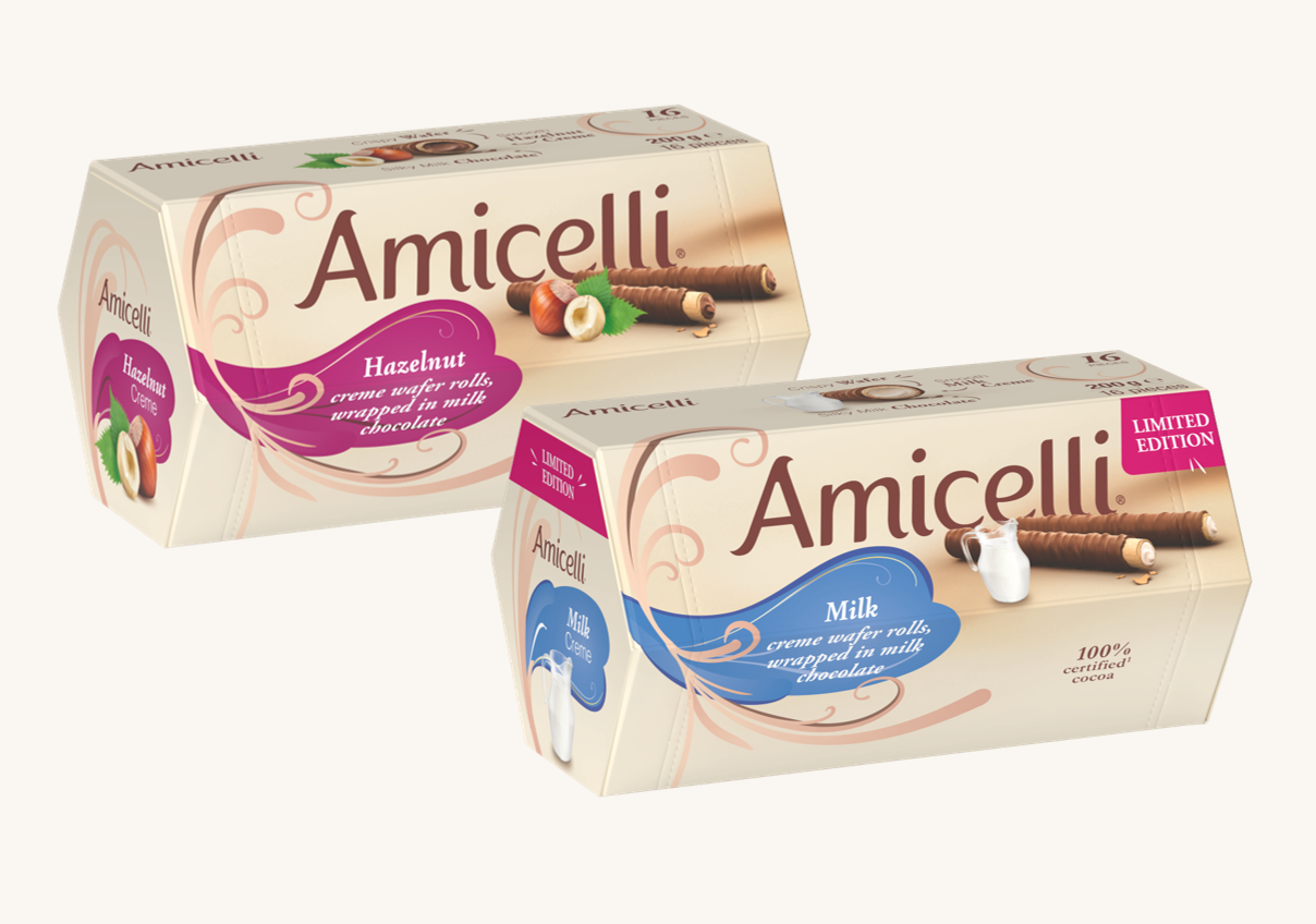
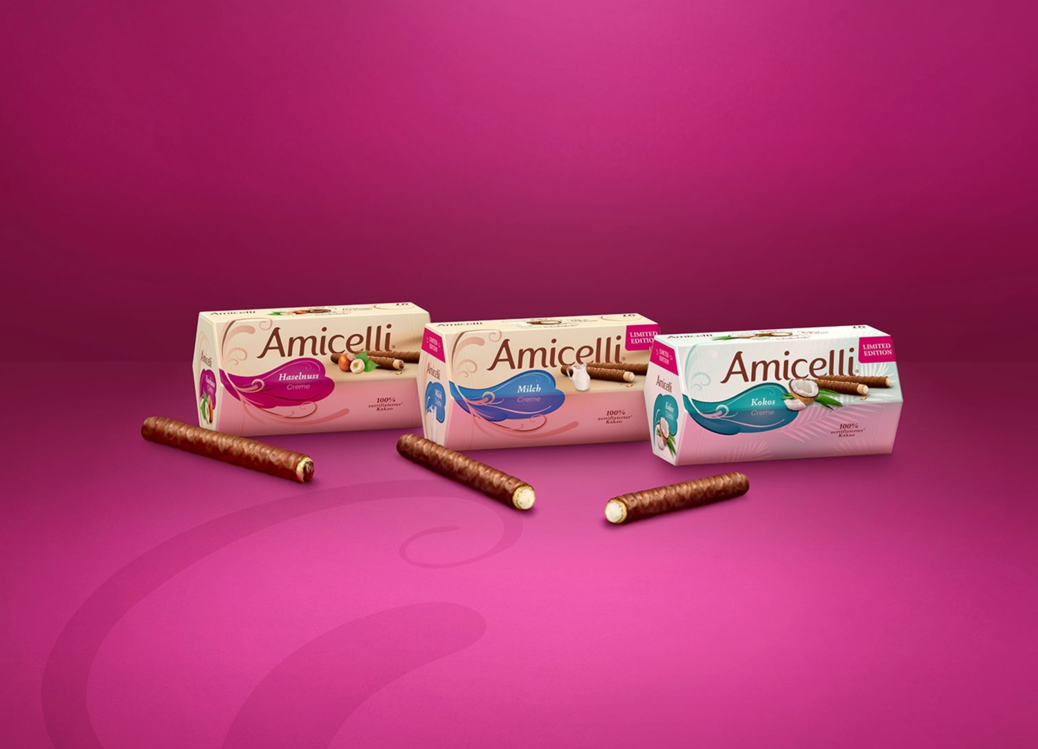
LOGO DO's & DONT's
The hexagonal packaging is iconic
for Amicelli, but also allows for the
packaging to turn on shelf.
The product packaging might therefore not
always be positioned in the prefect front view.
To make sure, that the logo is seen
from all sides, the logo should be integrated
on the following packaging sides.
Local variations due to legal restrictions
might be possible but need to be discussed
with Global Product Management.
PACKAGING

FONTS
PACKAGING
Three main font families are used for the Amicelli packaging.
HELVETICA & ADOBE GARAMOND PRO
are used for all communicative purposes
on the packaging front and sides.
Both fonts can be used in the regular
and bold styles as well as in capital letters to create
visual hierarchy and ensure a modern appearance.
HELVETICA NEUE PRO
On the back we use ‘Helvetica Neue Pro’ in the
condensed version to save as much space as possible.
For better structuring and hierarchy, the regular
and
bold font styles can be used here.

FONTS
COMMUNICATION & ALL OTHER CHANNELS
INTER
Inter is the newly defined font for Amicelli, which
is used in general correspondence and for all
communication outside of packaging.
The ‘Inter’-font should be used in PowerPoint
presentations, work reports, internal
documents and all other documents for Amicelli.
The font can be used in different styles (pls. see right)
and in capital letters to establish visual hierarchy and
ensure a modern look.

SITKA BANNER
As the 'Inter' font is a modern and cleaner typeface, a complementary font was introduced for Amicelli’s
communication to add a more emotional touch
while maintaining the brand essence.
This font, “Sitka Banner”, is available in both regular and
semi-bold weights and must always be used in italics.
It should be reserved for emphasizing individual words
(e.g. on key visuals or banners) or short phrases, such as
claims or headlines, particularly on platforms like
social media.

ACESS TO THE FONTS
Both fonts have already been installed on every
computer within the Ritter Sport network and can
therefore be used by all employees in all office
programs without any licenses.
If you might not have access yet, the font can also be downloaded from DAM: https://a5.adstream.com/thelibrary/#/collections/6
69f78184cedfd00017b46fe?size=1000
Or the INTER font can also be downloaded from
Google Fonts:
https://fonts.google.com/specimen/Inter
SIZES & SPACING
When choosing the font size, always pay attention
to legibility in relation to the dimensions
of the asset/document.
We recommend that official documents or assets
should not be smaller than font size 9.
Letter spacing should generally be kept ‘normal’, only
in exceptional cases, such as when something needs
to be emphasized, can the spacing be adjusted.
USAGE EXAMPLES
PACKAGING

Helvetica
Adobe Garamond Pro
Helvetica Neue Pro Condensed
KEY VISUALS

Inter – SemiBold
Inter - Light
SOCIAL MEDIA / DIGITAL BANNER

Sitka Banner - Italic
Inter - SemiBold
Inter - Light
FONTS COLOURS
GENERAL
COLOURS
The typography colour should always be
contrasting to the colours of the medium’s background.
On darker background colours, the font
colour white should be used.
While on lighter backgrounds the typography
colour should be in Amicelli Brown.
HIGHLIGHTS
If something needs to be highlighted specifically,
Amicelli Cream or Amicelli Violet can also be
used, but should still stand out from the
background to create a contrast.
For even more emphasis or to draw attention to
something specific, individual words or messages
can also be written in bold or in other font styles
such as light.
In addition, different font sizes, font cuts,
or different spacing can also be combined
to emphasize a message.

FONTS POSITIONING
COMMUNICATION
There are two options for positioning the message
(e.g. headline or claim):
Option 1: Center top - Amicelli logo is then placed center bottom
Option 2: Center bottom - Amicelli logo is then placed center top
A minimum distance to the horizontal edge, whether
at the top or bottom, should always be maintained.
This minimum distance to the lower or upper edge should be 20mm in portrait format and 15mm in landscape format.
For alignment and precise positioning of the message,
use the vertical line as a guide.
Text should always be placed straight in the layout and should never cover important elements or critical parts of an image.
When choosing a font size, always ensure that it is easy to read and select it according to the medium and intended use.
PROTECTION ZONES:
Messages (e.g. headline or claim) have defined protection
zones in all directions.
The minimum distance to the horizontal edges is
20mm in portrait format and 15mm in landscape format.
The minimum distance to the vertical edges is
20mm
in portrait format and
40mm in landscape format.

[Sticky Row Identifier]
Some countries are already successfully working
on bringing our brand to life. See best practices
and get inspired for your own journey.


TENDRIL
Discover one of the brands essential and well-known design elements - the tendril. And discover how we use it on packaging and for communication.
GET INSPIRED
Some countries are already successfully working
on bringing our brand to life. See best practices
and get inspired for your own journey.
